Tell your story with Charts
December 20, 2020, by Lipis
Telling a story
Charts primary reason to be created is to tell a story. I don’t know about you, but I often spend a lot of time configuring the chart to be telling the story I want. I will make one or two elements stand out by changing their color, adding arrows to annotate some parts, adding white boxes around information that’s extraneous… Unfortunately, this is often not well supported by charting libraries.
In my ideal workflow, I want to take the data and generate the chart, then treat all the elements of the chart as free form and modify them however I want. This is exactly how Excalidraw charting feature works! Once your chart is generated, you can use all the power of Excalidraw to style it, move things around, hide some details…
Examples

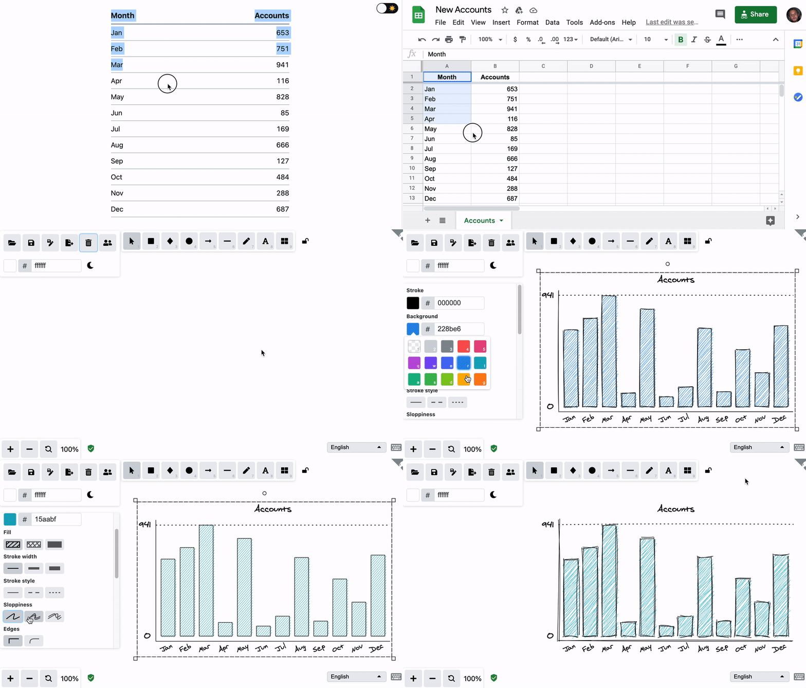
Copy any two columns data from Excel, Spreadsheet, or even HTML tables and paste it directly to Excalidraw. It will work when the number of columns is one or two. Here is the generated chart from the data below it.
| Month | Accounts |
|---|---|
| Jan | 653 |
| Feb | 751 |
| Mar | 941 |
| Apr | 116 |
| May | 828 |
| Jun | 85 |
| Jul | 169 |
| Aug | 666 |
| Sep | 127 |
| Oct | 484 |
| Nov | 288 |
| Dec | 687 |
But it doesn’t stop there. You can also copy the data from a plain text file as comma separated values (CSV). Open your favorite editor, type the values separated by comma or tab, copy/paste and you are ready to go. Here is another example from the data bellow the chart.
Day,Commits
Sun,143
Mon,167
Tue,92
Wed,114
Thu,128
Fri,155
Sat,193
Modifying the chart
Once the chart is imported you can select it and change any of the properties to adjust it to your needs. For example, here is the story of Excalidraw traffic in 2020.
Implementation
The implementation of this feature was done in two iterations and if you are interested on how it was done, check out the first pull request by petehunt and the second one by lipis. If you find any edge case, submit an issue and we will make sure to address it!
Discuss on Twitter • Edit on GitHub